Icon reference
You can find icons throughout the PhpStorm user interface: toolbars, tool windows, the editor gutter, and so on. Icons usually represent actions you can perform, options you can set, or additional information about an element.
Most icons have tooltips that explain what they mean. To view a tooltip, hover over an icon.
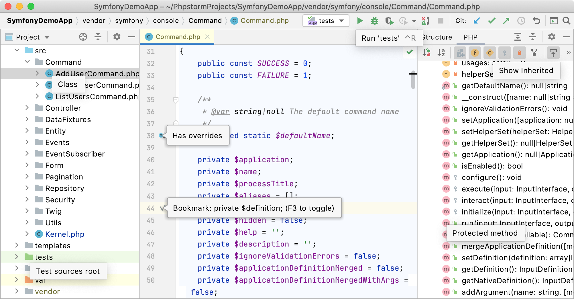
This reference describes different types of icons and visual indicators in PhpStorm. The availability of some icons might depend on the configuration of your project, the frameworks that you use, and the plugins that you have installed.
Main toolbar icons
Icons in the main toolbar, which is located in the window header, represent actions that apply either to the whole project or the whole IDE.
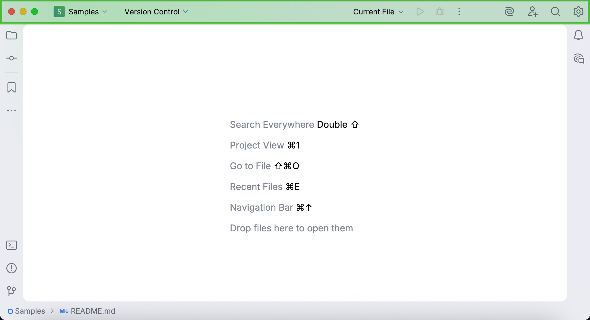
To learn how to add, remove, and edit the icons in the main toolbar, refer to Menus and toolbars.
Tool window bar icons
Icons in tool window bars represent different tool windows in PhpStorm. If you click one of these icons, its corresponding tool window will open.
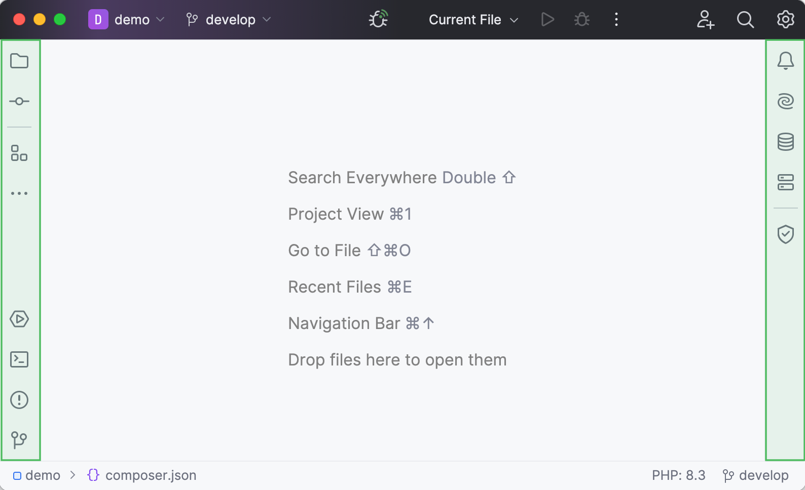
To learn how to add, remove, and rearrange the icons in tool window bars, refer to Tool windows in the new UI.
Toolbar icons in tool windows
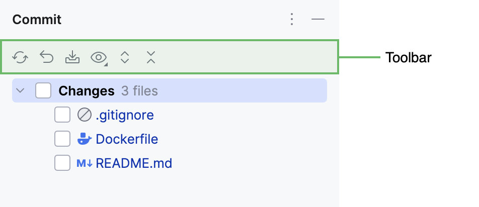
Some tool windows have toolbars with icons that represent actions and options relevant to the tool window.
File type icons
File type icons let you quickly identify file types in your project. You can find them in selected tool windows (for example, the Project tool window).
Each file format in PhpStorm has a dedicated icon. To view all recognized file types and their icons, open the the Settings dialog (Ctrl+Alt+S) , and go to .
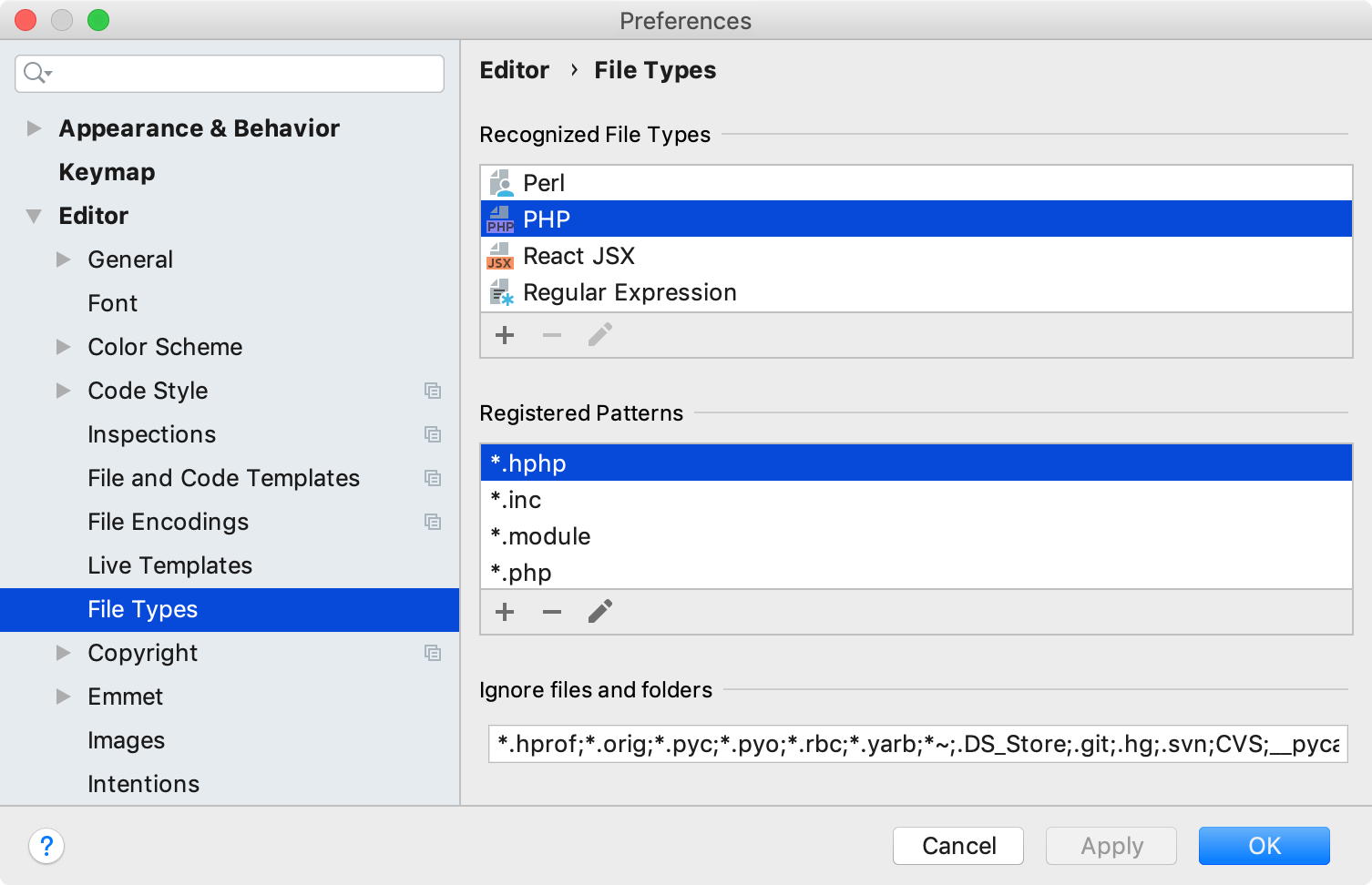
File type icons are predefined and cannot be customized through the UI.
Project item icons
Project item icons let you quickly identify types of items in your project, such as directories, content roots, classes, and so on. You can find them in selected tool windows (for example, the Project tool window).
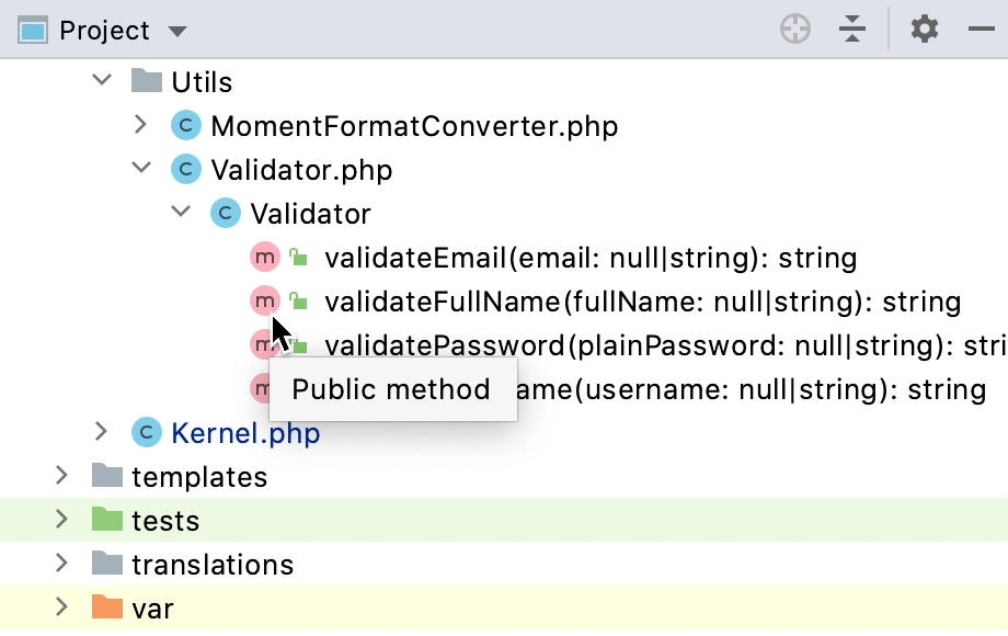
Project item icons are predefined and cannot be customized through the UI.
Project item colors
PhpStorm uses color highlighting for project items in several ways: for example, through colored backgrounds or colored names. Each color style represents a different type of information.
A colored background indicates that the item is part of a scope, which is a named set of folders, files, and packages in a project.
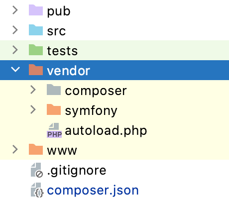
By default, background colors are configured for two scopes: tests (green) and non-project files (yellow). To learn how to customize scope colors, refer to Associate scopes with colors.
A colored name indicates that the item is under version control, and the color reflects its VCS status.
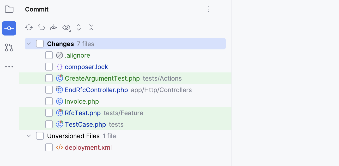
To view all VCS status colors and their meanings, open the the Settings dialog (Ctrl+Alt+S) , and go to . To learn how to customize status colors, refer to File status highlights.
Gutter icons
Icons in the editor gutter (a vertical area on the left side of the editor) let you perform code-related actions, such as running a method or navigating to an interface implementation. Some gutter icons also provide additional information about the code elements.
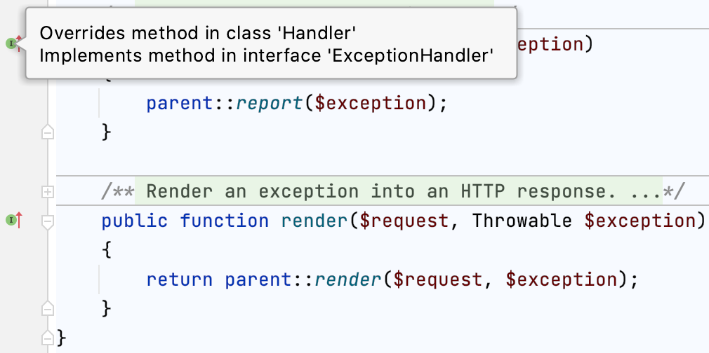
To view all available gutter icons and their meanings, open the the Settings dialog (Ctrl+Alt+S) , and go to . Gutter icons are predefined and cannot be customized through the UI, but you can choose which ones you want to display.
Bookmarks
Bookmarks let you quickly return to specific code lines or project items whenever you need them. Icons for code line bookmarks are displayed in the gutter, next to the line numbers.
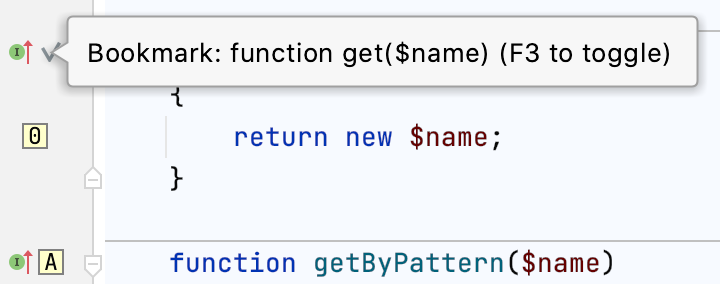
Project item bookmarks do not have icons. To find bookmarked project items, open the Bookmarks tool window (Alt+2).
There are two types of bookmarks: anonymous and mnemonic (with letters
![]() or numbers
or numbers ![]() ). To learn how to create different types of bookmarks, refer to Add bookmarks.
). To learn how to create different types of bookmarks, refer to Add bookmarks.
Breakpoints
Breakpoints are used to debug code: they suspend program execution at a specific point, which lets you examine the program state and behavior. Breakpoint icons are displayed in the gutter, where they replace the line numbers.
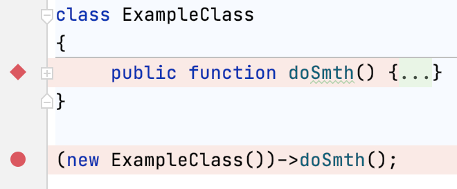
Breakpoints might have different icons and colors depending on their type and status. To view all available icons and their meanings, refer to Breakpoint icons. To learn how to create different types of breakpoints, refer to Set breakpoints.
Change markers (VCS)
Change markers let you quickly identify which code lines have been modified since the last commit. They are displayed on the right side of the gutter and are color-coded. If you click a change marker, the IDE opens a popup with icons that represent VCS-related actions, such as committing a change or rolling it back.
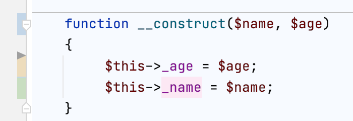
Each color represents a different type of change. To view all change marker colors and their meanings, open the Settings dialog (Ctrl+Alt+S) , and go to . To learn how to customize change marker colors, refer to Version control in the editor gutter.
Code coverage markers
Code coverage markers let you quickly identify which code lines were executed during the most recent run with coverage. They are displayed on the left side of the gutter and are color-coded.
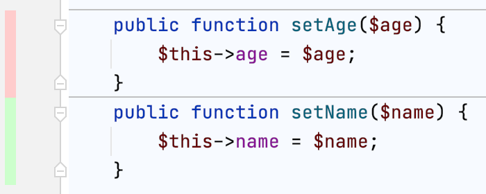
Each color represents a different coverage status: by default, green represents full coverage, yellow represents partial coverage, and red represents no coverage. To learn how to customize coverage marker colors, refer to Change colors of the coverage highlighting.
Database object icons
Install the Database Tools and SQL plugin
This functionality relies on the Database Tools and SQL plugin, which you need to install and enable.
Press Ctrl+Alt+S to open settings and then select .
Open the Marketplace tab, find the Database Tools and SQL plugin, and click Install (restart the IDE if prompted).
Database object icons let you quickly identify different types of introspected database objects. You can find them in selected tool windows (for example, Database, Database Changes, and Services), the code editor, the data editor, and so on. Each database object has a dedicated icon.
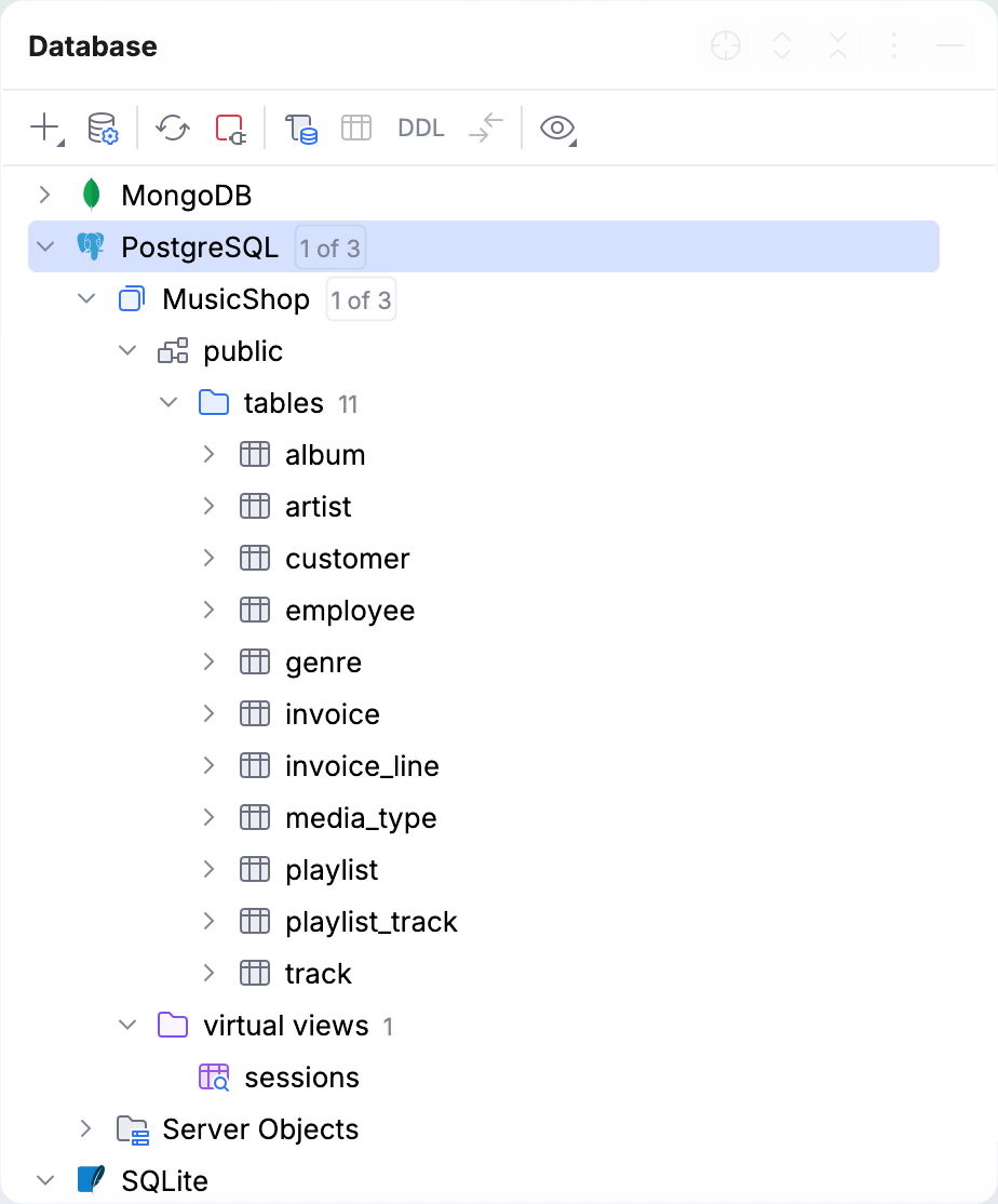
For more information about data source and database object icons, refer to the reference chapters of the Database tool window topic: