Icons
Icons make it easy to find and explore features in ReSharper and Rider. They can appear in buttons that execute actions, in navigation to differentiate between members, in the gutter to highlight source code, or as various indicators to visualize results (unit testing, solution-wide analysis).
Typically, icons come in different colors and tones to match the user-selected theme (light, dark, etc.). You can change the theme:
Product | Menu Path |
|---|---|
ReSharper | |
Rider | |
Visual Studio |
Themed Icons
The SDK comes with an extensive set of icons that are probably already familiar to you.
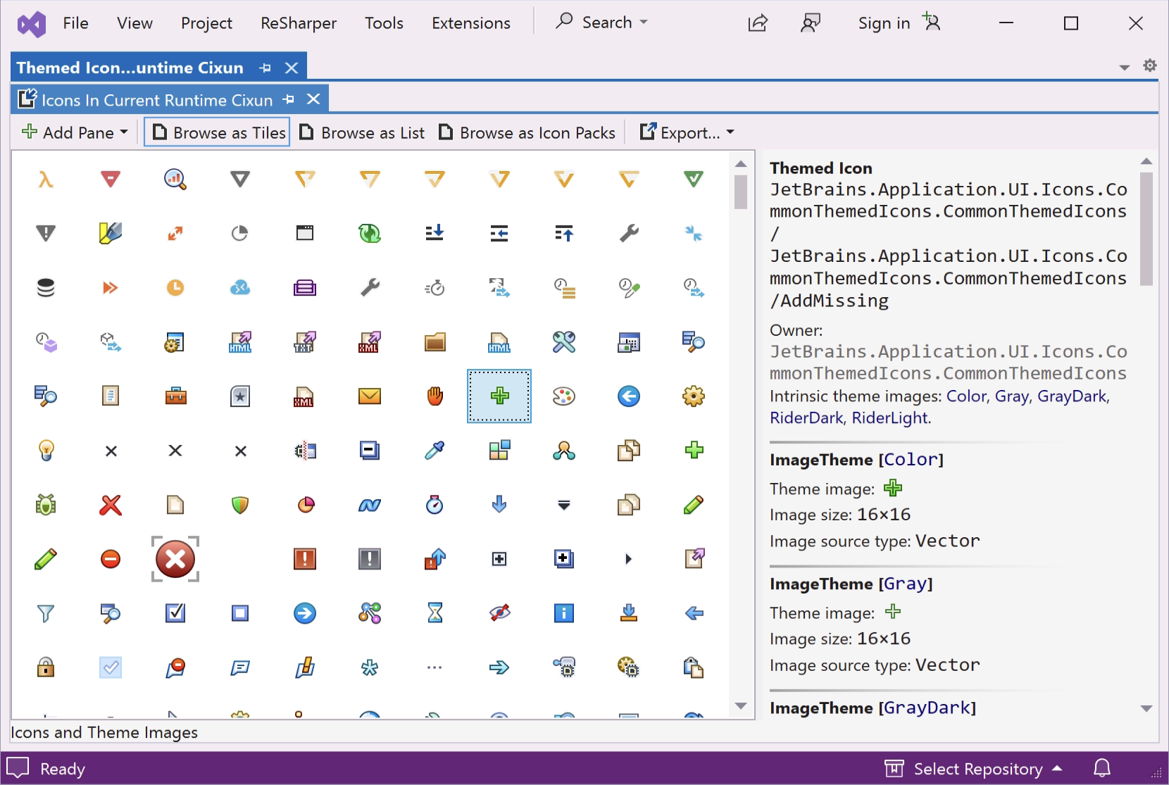
You can browse the library in ReSharper's internal mode (devenv.exe /ReSharper.Internal) by navigating to :

On the right-hand side, you can see the name of the icon as well as the icon pack it belongs to (here AddMissing and CommonThemedIcons). Those names should be enough to reference them in your code through code-completion. Each icon is contained in its own class under the *ThemedIcons icon pack class. Depending on the way the SDK is asking for an icon, you can pass them as:
typeof(MyPluginThemedIcons.Icon)orMyPluginThemedIcons.Icon.Id
Custom Compiled Icons
Similar to the icons that come out-of-the-box, you can add your own icons as compiled icons. Although compiled icons can also be generated from PNGs, it is highly recommended to use SVGs, as they'll render without any issues on all resolutions.
Prepare SVG for Conversion
SVG is a very rich format, but ReSharper can only create compiled icons from so-called optimized SVGs. Once you have your SVG, you can optimize it using the latest version of Inkscape.
Open the SVG, select , choose Optimized SVG, and enable the following options after hitting Save:
Options
Shorten color values
Convert CSS attributes to XML attributes
SVG Output
Remove the XML declaration
Remove metadata
Remove comments
IDs
Remove unused IDs
Prepare for different Themes
If your icons should adapt to different themes, you must provide multiple files with a theme-selector next to each other:
<name>[Color].svg– corresponds to light themes<name>[GrayDark].svg– corresponds to dark themes
Export Compiled Icons
Once your SVG icons are prepared and located in a common directory:
Open the Themed Icon Viewer
Choose Add Pane | Directory with Icon Files
Select all icons you want to export
Choose Export | Export C# Code – SVG Body
A file with the compiled icons should open. You can rename any of the icon classes, the icon pack class, or move them to another namespace.
Rider Icons
Icons that only surface in Rider (e.g., for run configurations or tool windows) are handled through the IntelliJ SDK. The equivalent of exporting compiled icons is to create a MyPluginThemedIcons.kt as follows:
The MyPluginThemedIcons.kt and your SVG icons should be located as follows: