
Class Components With Props
Make a simple class component with a single prop, again with a TypeScript interface describing the props.
In the previous step we made a "dumb" presentational component with one property. In React, components can have properties and state. When they have state (or when they need access to React's lifecycle methods), we use a class-based component instead. In recent years, React has made these available to functional components as well.
We're going to build a stateful counter component.
Each click increments the click count, with the current count value stored in local component state.
The <Counter/> component will be passed in some props.
In this step, we'll show component props -- as done with a function in the previous step -- for class-based components.
We'll do state in the next step, followed by event handlers.
Code
The finished code for this tutorial step is in the repository.
First a Test
This tutorial series shows class-based component development using testing instead of a browser. Let's write a broken test first, then do the implementation which fixes the test.
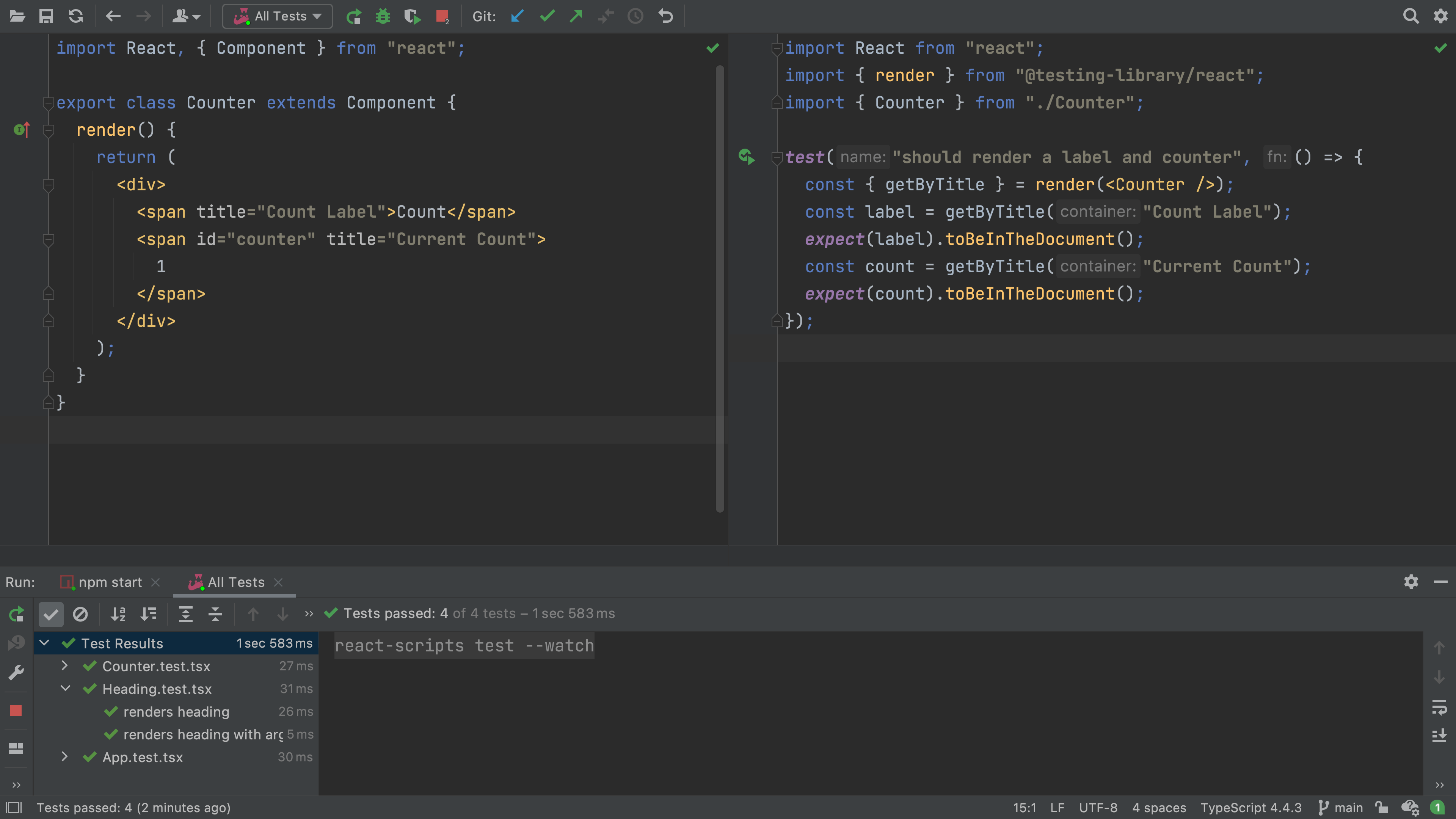
Make a new file called Counter.test.tsx with this test, to ensure we have a label and a current count:
import React from "react";
import { render } from "@testing-library/react";
import { Counter } from "./Counter";

test("should render a label and counter", () => {
	const { getByTitle } = render(<Counter />);
	const label = getByTitle("Count Label");
	expect(label).toBeInTheDocument();
	const count = getByTitle("Current Count");
	expect(count).toBeInTheDocument();
});
The test fails, but even more quickly, TypeScript immediately tells you that you are missing an import. Good, we're doing TDD!
Now create a file Counter.tsx. We'll make it a very simple class to start:
import React, { Component } from "react";

export class Counter extends Component {
	render() {
		return (
			<div>
				<span title="Count Label">Count</span>
				<span id="counter" title="Current Count">
					1
				</span>
			</div>
		);
	}
}
Back in our test, click on <Counter/> and hit Alt-Enter to resolve the import.
Save the file and see that your test passes:
Not a bad first step.
Pass In a Prop
As we did in the previous step, we'll use a consistent process:
-
Work first in the test by writing a failing test
-
Then fix the
Counterpresentation component -
Then fix the wrapper component that uses the
Counter
Thus, let's add a test for the case of passing in a label:
test("should render a counter with custom label", () => {
	const { getByTitle } = render(<Counter label={`Current`} />);
	const label = getByTitle("Current Count");
	expect(label).toBeInTheDocument();
});
The test fails, which is good -- the label is still Count, not Current.
What's even better -- TypeScript helped us "fail faster".
Before running the test, it told us we broke the contract saying no properties were expected.
Even better, our IDE visually warned us with a red squiggly.
Let's now work on the implementation. Classes handle props with defaults a little differently:
export class Counter extends Component<{ label?: string }> {}
Component is a "generic" type, with 0, 1, or 2 parameters in between the <>.
We have one parameter...for the shape of the props.
As we did in the previous step, let's move the inline prop definition to a standalone, exported type:
export type CounterProps = { label?: string };

export class Counter extends Component<CounterProps> {}
The type definition says label can be optional.
Can we define a default prop value, as we did for functions?
Yes, and a clever approach using destructuring and defaults comes into play:
export class Counter extends Component<CounterProps> {
	render() {
		const { label = "Count" } = this.props;
		return (
			<div>
				<span title="Count Label">{label}</span>
				<span id="counter" title="Current Count">
					1
				</span>
			</div>
		);
	}
}
Inside render we made a local const for the label value.
Its value was "destructured" from the props, and when not in props, was given a default value.
With this...our test passes!
Wire Into UI
We have a <Counter/> component that takes an optional label.
Tests pass.
Let's now use it in our app and, at long last, view it in the browser.
Open App.tsx and change the TSX that in render:
function render() {
	return (
		<div>
			<Heading />
			<Counter label={"Current"} />
		</div>
	);
}
Did you notice the autocompletion by the IDE, which knew there was a component with a name starting with those letters, somewhere in the project? And when you accepted the completion, it generated the import? Also, the IDE helped on the available props and the types for those props.
All of our tests still pass.
Let's change the renders hello react test in App.test.tsx to look for the label in the new <Counter/> child component:
test("renders hello react", () => {
	const { getByTitle, getByText } = render(<App />);
	const linkElement = getByText(/hello react/i);
	expect(linkElement).toBeInTheDocument();
	const label = getByTitle("Count Label");
	expect(label).toBeInTheDocument();
});
Now restart the start script and look at the UI in the browser.
We should now see Current1 in the UI.
While this step didn't do too much that was new -- after all, we had optional props and interfaces in the previous step, with functions -- it paves the way for stateful components.