Component properties
Install the Swing UI Designer plugin
This functionality relies on the Swing UI Designer plugin, which you need to install and enable.
Press Ctrl+Alt+S to open settings and then select .
Open the Marketplace tab, find the Swing UI Designer plugin, and click Install (restart the IDE if prompted).
The gray shaded section of the property inspector provides a set of properties that are proprietary to UI Designer and used by its code generation and other processes.
When a component is added to a form, it can be created as a component or as a container. In the latter case, such a component acquires certain properties that are specific to the containers only. In the tables below, the properties that pertain to the containers are specially noted.
You will find the following categories of properties in this section:
Properties are layout-specific. Some of the properties can be missing for certain layout managers.
Code Binding Properties
The properties covered in this section are related to binding of GUI forms and components to source code.
Property | Description |
|---|---|
bind to class | This is a property of Forms only. It specifies the name of a class that contains the logic to make the form work. When this property is set to a valid class, we say the Form is bound to the class. If no target class exists yet, you can still type in the name of this future class. IntelliJ IDEA will offer a quick-fix to create a class of the specified name for you whenever the property is focused. You can use the quick-fix to create the class whenever you are ready. |
field name | This is a property of components. It specifies the name of the field in the parent form's class to which the component is bound. For most components, a default field name is automatically entered, and a corresponding declaration is written to the Form's bound source file. You can change the default field name in the Inspector if you wish, and the source will be updated automatically. You can optionally change the field name in the source file, and the change will reflect in the Inspector when you return to the GUI Designer. |
Custom Create | This is a property of components. If the option is checked, it means that you want to call a non-default constructor for the component, rather than generate a default constructor during the runtime build of the GUI. Code generation will ignore the component and assume you have written a constructor method. If a non-default constructor does not yet exist, IntelliJ IDEA will show you a quick-fix whenever the Custom Create property is focused in the Inspector. You can use this to create the constructor in the source file bound to the parent Form. |
Component Sizing Properties
The properties described in this section affect how components are sized at design time and at runtime.
Property | Subproperty | Description |
|---|---|---|
Horizontal Size Policy Vertical Size Policy | These properties define how dimensions of a component are affected by resizing of its container along the horizontal axis and vertical axis respectively. This property applies to the GridLayoutManager (IntelliJ) and has the following subproperties: | |
canShrink | The element size can be diminished (less than the preferred size) when the pane is resized. | |
canGrow | The element size can be enlarged when the pane is resized. | |
wantGrow | The element size is enlarged when the pane is resized. This flag takes precedence over canGrow. | |
These options can be set simultaneously. | ||
Same Size Horizontally | This is the property of a container that wraps the component. When the option is checked, all columns in the layout grid are always sized equally. Applicable only to the GridLayoutManager(IntelliJ). | |
Same Size Vertically | This is the property of a container that wraps the component. When the option is checked, all rows in the layout grid are always sized equally. Applicable only in the GridLayoutManager(IntelliJ). | |
Minimum Size Preferred Size Maximum Size | For the Swing layout managers, these properties are the same as in Java SDK. For the layout managers GridLayoutManager(IntelliJ) and FormLayout, these properties are different from those used in the Java SDK. To be more specific, they are not actual properties but a part of constraints with which a component is added to a container. Such feature enables you to set a size value only for 1 dimension. For instance, if you set Preferred Size values as
|
Layout and Alignment Properties
The properties described in this section control various aspects of the component layout and alignment.
Property | Subproperty | Description | |
|---|---|---|---|
Layout Manager | This is a property of container type components only (e.g. JPanel, JScrollPane). The setting controls which layout manager the container uses. The setting affects both design-time and runtime. Find the list of supported layout managers in the section GUI Designer Options of the Settings dialog. | ||
border | Defines how the component border and (optional) title will look. Applies to container type components only and includes the following subproperties: | ||
type | Specifies the bevel characteristics of the element border.
| ||
title | Optionally specify a string to appear as the container's title at runtime. You can enter a string literal directly in the edit field, or click the ellipsis button to open a dialog where you can either hard-code a string value or specify the identifier of a resource. | ||
title justification | Controls how the text of title is justified.
| ||
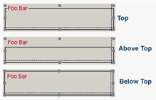
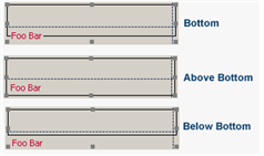
title position | Controls where the title is positioned with respect to the container border. A horizontal position of the text is controlled by the title justification setting. Default, Above Top, Top, Below Top, Above Bottom, Bottom, Below Bottom, as shown in the following images:   | ||
title font | Controls the font used for displaying the text of the title. | ||
title color | Controls the color of the font used for displaying the text of the title. The ellipsis button opens a color picker, where you can choose a color from several palettes (AWT, Swing, or System), enter an RGB or HSB color value, or select from a set of color swatches. | ||
margins | This property of JPanel controls the amount of spacing between the outer border of the container, and its contents. Applies to FormLayout and GridLayoutManager(IntelliJ). | ||
Top Right Bottom Left | Each attribute controls the spacing at the respective edge of the pane. The value of each attribute is an integer that specifies the number of pixels in the respective spacing. Zero means no space. | ||
Horizontal Gap Vertical Gap | This is a property of JPanel only and has an effect only when the pane uses a grid type layout manager such as the default GridLayoutManager. The property defines the pixel dimension of a space inset between the edge of a grid cell in the pane and the edge of a contained component (a JRadiobutton, for example). The default value is -1, which indicates the default spacing. You can enter zero or any positive integer value and see the result at design time. For Vertical Gap to have any effect, the layout grid should have at least 2 rows. | ||
Horizontal Align | This property determines the relative horizontal position of a component within its container. Select a value from the drop-down list:
| ||
Vertical Align | This property determines the relative vertical position of a component within its container. Select a value from the drop-down list:
| ||
Indent | This property is only applicable for GridLayoutManager. Valid values are zero or any positive integer. The selected component is shifted to the right by the specified number of pixels times ten. For example, if you enter 12, the indent will be 120 pixels (12 * 10). | ||
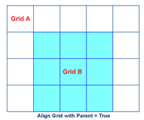
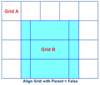
Align Grid with Parent | This is a property of panes and applicable with grid type layout managers. When checked, it means that grid columns and rows in a child (nested) container always align with the rows and columns of the parent container. If not checked, the grid columns and rows of a child container may be aligned independently:   | ||
Other Properties
This section describes other GUI Designer properties that are not classified any other way.
Item | Description |
|---|---|
Client Properties | This is a property with configurable sub-properties. If you develop your own components, you can configure a Custom Property in the GUI Designer to support it. |