Use automatic plotting
Datalore supports automatic plotting for pandas DataFrames. With this feature, you can quickly get a visualization of your data, customize it, and export the result as a code for your notebook.
Generate and customize your data visualization
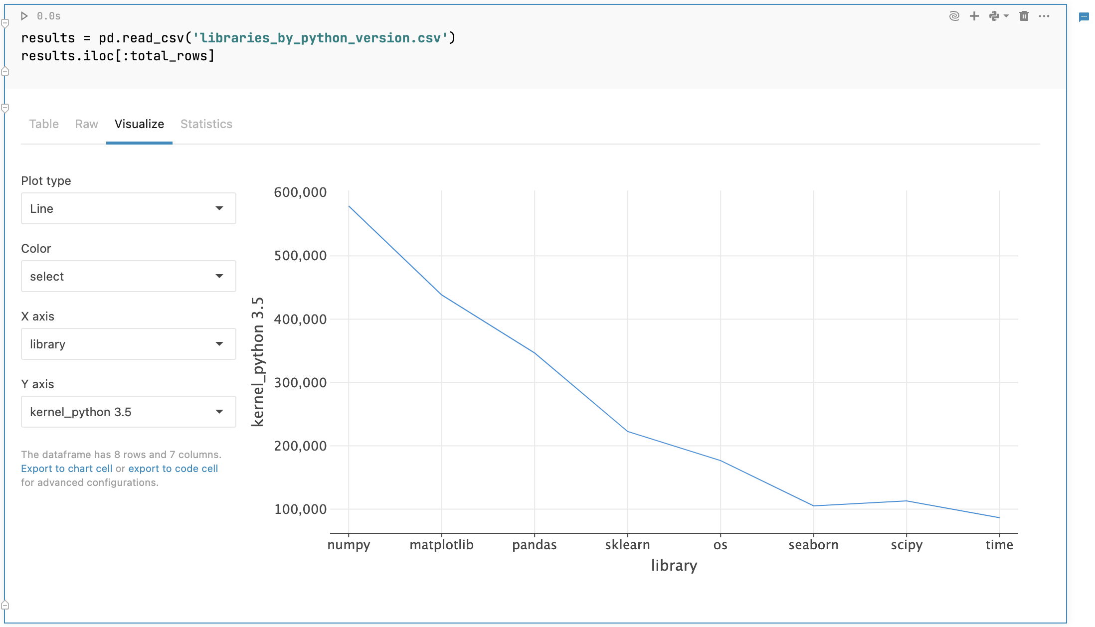
When your data is ready, switch to the Visualize tab from your output. You will get a point chart representing the data from the first two columns of your DataFrame.

Customize your visualization:
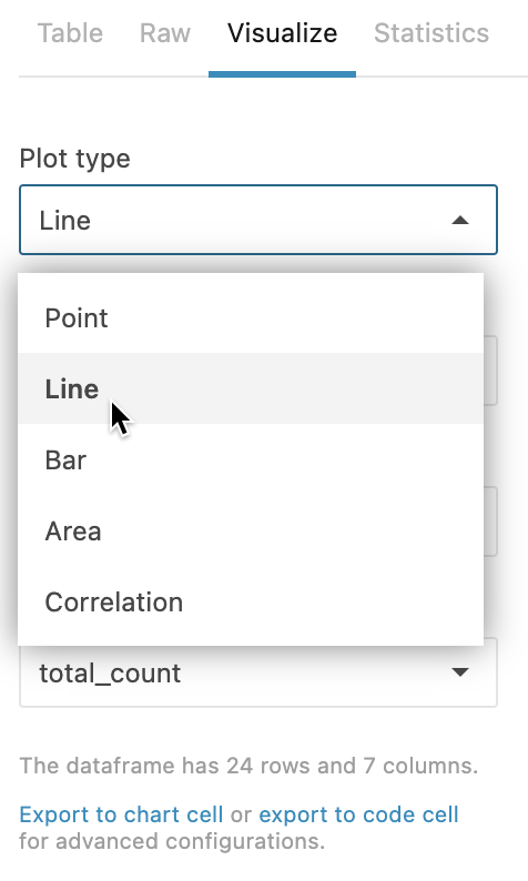
For the chart type, expand the Plot type list and select one of the options :
Point(default)
Line
Bar
Area
Correlation

To set up a color palette, expand Color list and select a column.
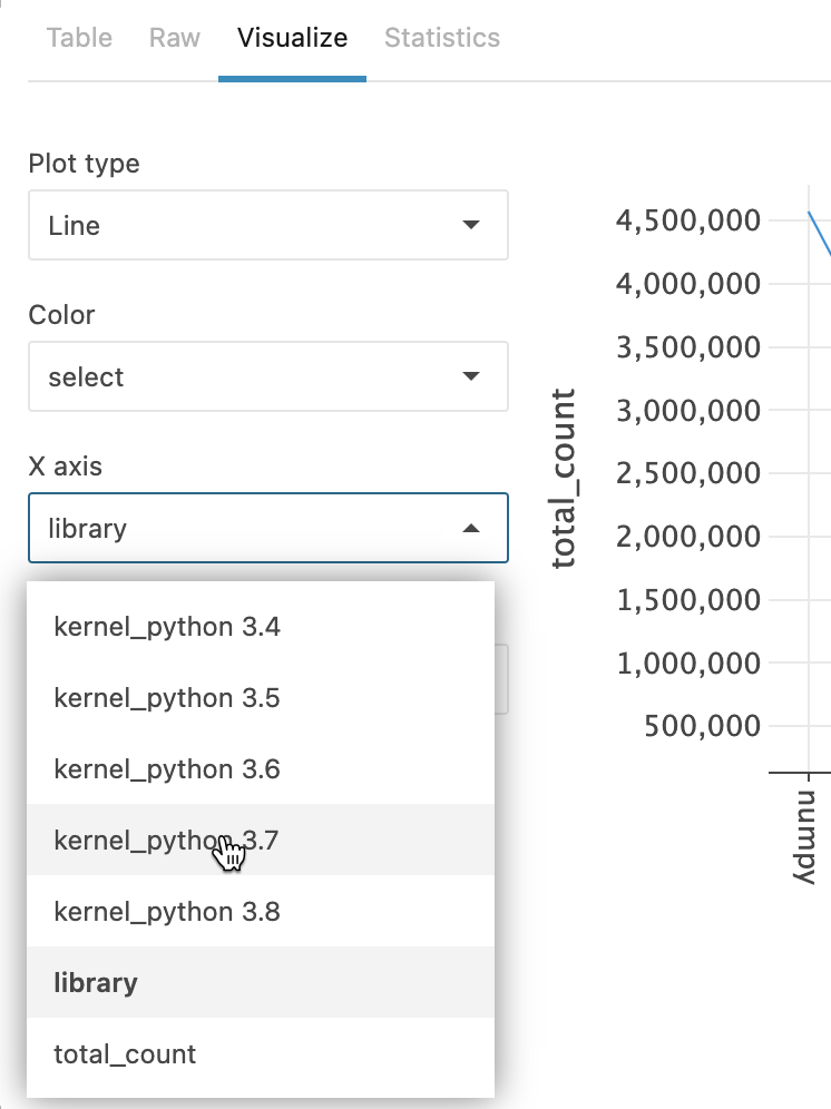
By default, the graph represents the data from the first two columns of your DataFrame. To plot other data, expand the list for axis X or Y and select a column.

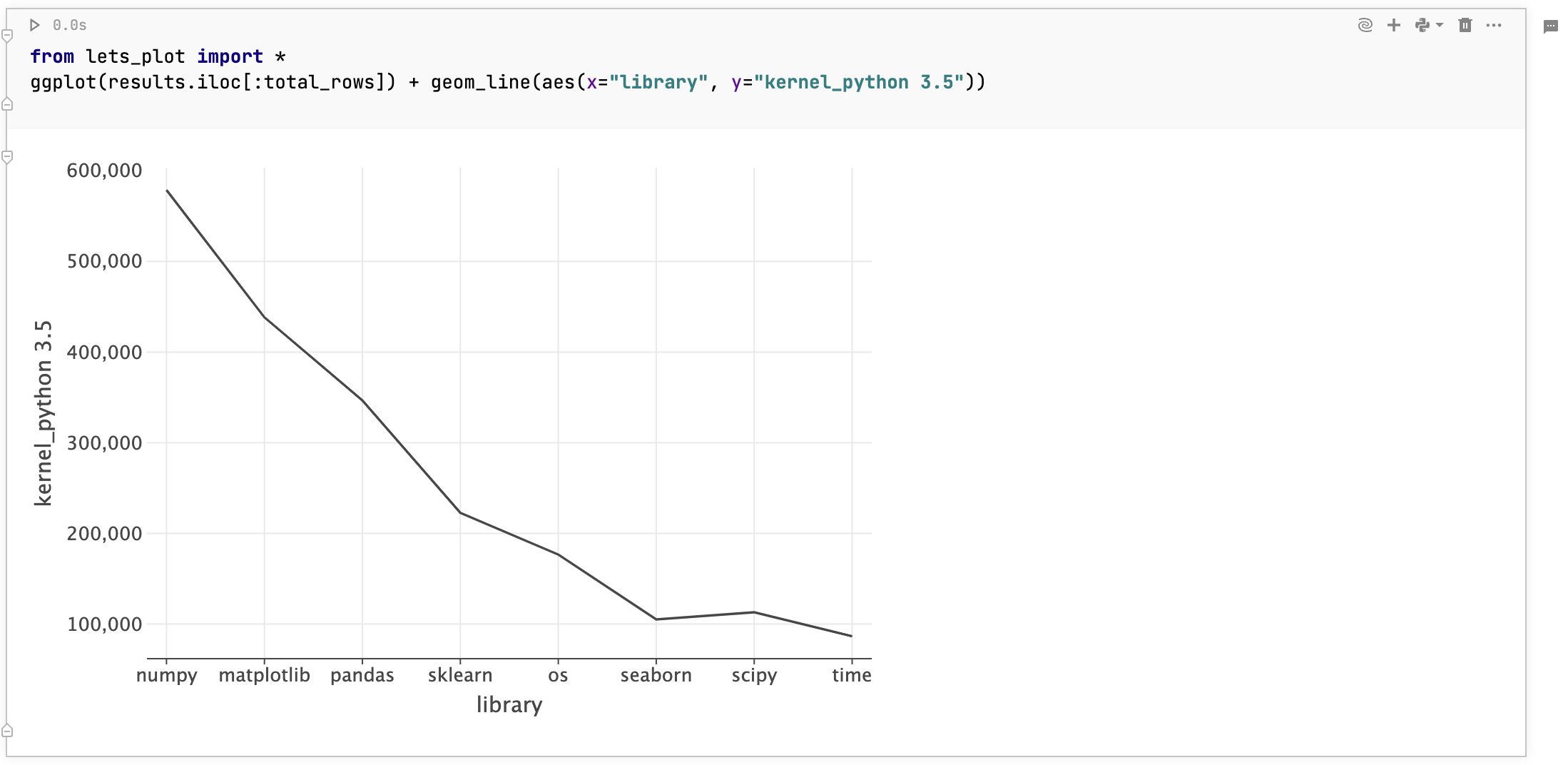
Visualization code export
You can export visualization code to a chart or code cell. That way, you can:
Apply advanced customization to your plot
Save your customized plot for demonstrations after the notebook is published (the Visualize tab not being available in the published version)
Copy the respective plots from code cell output
To export your visualization code, click Export to chart cell or export to code cell below the customization options to the left of the plot.
The code that builds the graph will be added to your notebook in a new respective type cell.

Visualize tab and chart cell compared
While both elements allow you to plot your data quickly and with no coding involved, they are not the same:
Visualize tab: Plotting is performed on the client side. Created visualizations are mainly used for quick exploratory analysis on sampled datasets.
Chart cells: Plotting is performed on the server side. The feature facilitates collaboration and allows to build multilayered charts based on datasets of any size. Find more information in Build advanced visualizations.
Keywords
plotting, quick charts, easy charts, visualize data, easy graphs, quick graphs, quick plots, easy plots