What's new in Compose Multiplatform 1.6.0
Here are the highlights of the Compose Multiplatform 1.6.0 release:
Dependencies
This version of Compose Multiplatform is based on the following Jetpack Compose libraries:
Breaking changes
Padding for text with lineHeight set trimmed by default
With the added support for LineHeightStyle.Trim, Compose Multiplatform aligns with Android in the way text padding is trimmed. See the pull request for details.
This is in line with compose.material changes from the 1.6.0-alpha01 release:
The
includeFontPaddingparameter becamefalseon Android by default. For a deeper understanding of this change, see the discussion on not implementing this flag in Compose Multiplatform.The default line height style has been changed to
Trim.NoneandAlignment.Center. Compose Multiplatform now supportsLineHeightStyle.Trimand implementsTrim.Noneas the default value.Explicit
lineHeighthave been added toTextStyleofTypography, which led to the next breaking change.
Using fontSize in MaterialTheme requires lineHeight
If you set the fontSize attribute for a Text component in MaterialTheme but don't include lineHeight, the actual line height will not be modified to match the font. Now, you have to explicitly specify the lineHeight attribute every time you set the corresponding fontSize.
Jetpack Compose now recommends not setting the font size directly:
New approach to resource organization
If you have been using the resources API in preview versions of Compose Multiplatform 1.6.0, familiarize yourself with the documentation for the current version: 1.6.0-beta01 changed the way resource files should be stored in the project folders to be available to the project code.
Across platforms
Improved resources API (all platforms)
The new experimental API adds support for strings and fonts and allows you to share and access resources in common Kotlin more comfortably:
Resources can be organized according to specific settings or constraints they are designed for, supporting:
Locales
Image resolutions
Dark and light themes
Compose Multiplatform now generates a
Resobject for each project to provide straightforward resource access.
For a closer look at resource qualifiers, as well as a more in-depth overview of the new resources API, see Images and resources.
UI testing API (Experimental, all platforms)
The experimental API for UI testing with Compose Multiplatform, which was already available for desktop and Android, now supports all platforms. You can write and run common tests that validate the behavior of your application's UI across platforms supported by the framework. The API uses the same finders, assertions, actions, and matchers as Jetpack Compose.
For the setup instructions and test examples, see Testing Compose Multiplatform UI.
Changes from Jetpack Compose and Material 3 (all platforms)
Jetpack Compose 1.6.1
Merging the latest release of Jetpack Compose positively affects performance on all platforms. For details, see the announcement on the Android Developers Blog.
Other notable features from this release:
The change to default font padding came into effect only for Android targets. However, make sure to take into account a side effect of this change.
Mouse selection was already supported in Compose Multiplatform for other targets. With 1.6.0, this includes Android, too.
Jetpack Compose features that are not ported to Compose Multiplatform yet:
Multiplatform drag and drop. Works only on Android right now. On desktop, you can use an existing API,
Modifier.onExternalDrag.
The JetBrains team is working on adopting these features in upcoming versions of Compose Multiplatform.
Compose Material 3 1.2.0
Release highlights:
A new experimental component
Segmented Button, with single and multiple selection.Expanded color set with more surface options to make it easier to emphasize information in your UI.
Implementation note: the
ColorSchemeobject is now immutable. If your code currently modifies the colors inColorSchemedirectly, you will need to make use of the copy method now to change colors.Instead of a single surface value, there are now several options for surface color and surface container for more flexible color management.
For more details on changes in Material 3, see the release post on the Material Design Blog.
Separate platform views for popups, dialogs, and dropdowns (iOS, desktop)
Sometimes, it's important that popup elements (for example, tooltips and dropdown menus) are not limited by the initial composable canvas or the app window. This becomes especially relevant if the composable view does not occupy the full screen but needs to spawn an alert dialog. In 1.6.0, there is a way to achieve that reliably.
Note that popups and dialogs are still unable to draw anything out of their own bounds (for example, a shadow of the topmost container).
iOS (Stable)
On iOS, the feature is active by default. To switch back to the old behavior, set the platformLayers parameter to false:
Desktop (Experimental)
To use the feature on desktop, set the compose.layers.type system property. Supported values:
WINDOW, for creatingPopupandDialogcomponents as separate undecorated windows.COMPONENT, for creatingPopuporDialogas a separate Swing component in the same window. It works only with offscreen rendering, withcompose.swing.render.on.graphicsset totrue(see the Enhanced Swing interop section of the 1.5.0 Compose Multiplatform release notes). Note that offscreen rendering only works forComposePanelcomponents, not full window applications.
An example of the code that uses the COMPONENT property:
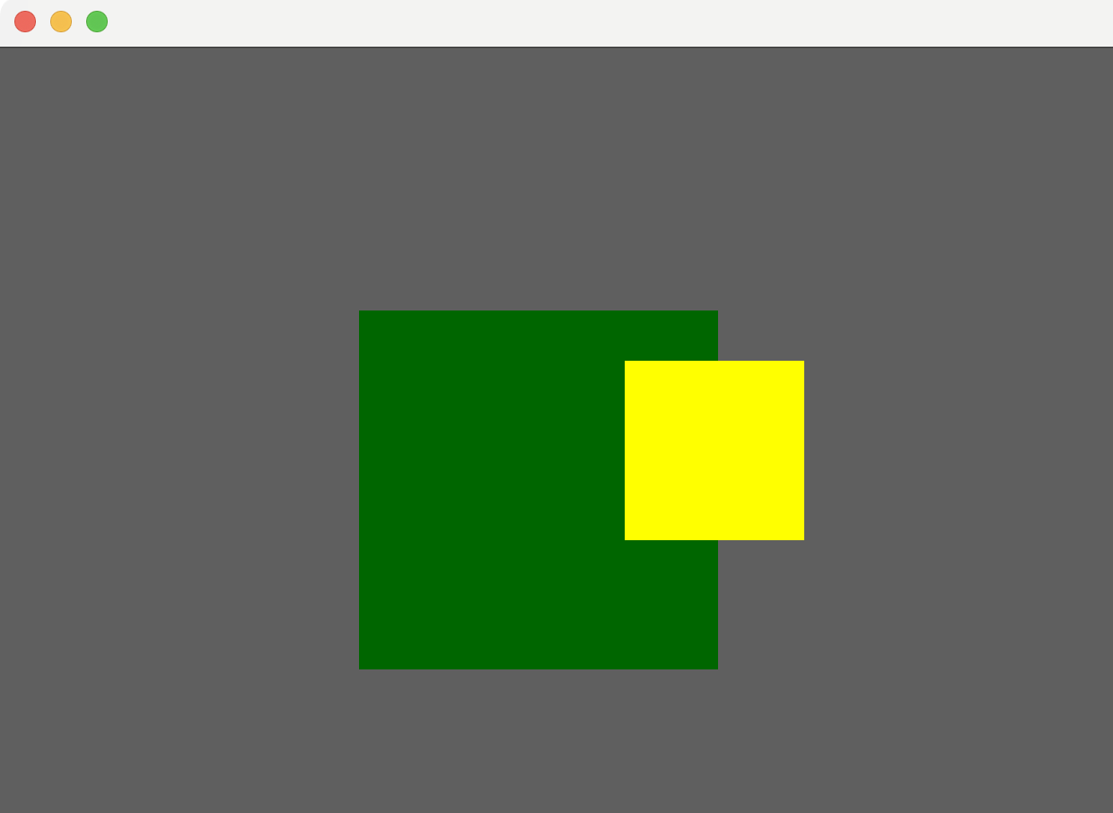
The Dialog (yellow) is drawn in full, regardless of the bounds of the parent ComposePanel (green):

Support for text decoration line styles (iOS, desktop, web)
Compose Multiplatform now allows setting underline styles for text using the PlatformTextStyle class.
An example of setting a dotted underline style:
You can use solid, double-width solid, dotted, dashed, and wavy line styles. See all available options in the source code.
Accessing fonts installed on the system (iOS, desktop, web)
You can now access fonts installed on the system from your Compose Multiplatform app: use the SystemFont class to load fonts with appropriate font styles and font weights:
On desktop, you can use the FontFamily function to load all possible font styles by specifying a font family name only (see the code sample for an extensive example):
iOS
Accessibility support
Compose Multiplatform for iOS now allows people with disabilities to interact with Compose UI with the same level of comfort as with the native iOS UI:
Screen readers and VoiceOver can access the content of the Compose UI.
Compose UI supports the same gestures as the native UIs for navigation and interaction.
This also means that you can make the Compose Multiplatform semantic data available to Accessibility Services and the XCTest framework.
For details on implementation and customization API, see Support for iOS accessibility features.
Changing opacity for composable view
The ComposeUIViewController class has one more configuration option now, changing the opacity of a view's background to be transparent.
An example of what a transparent background can help you achieve:

Selecting text in SelectionContainer by double and triple tap
Previously, Compose Multiplatform for iOS allowed users to use multiple tap for selecting text only in text input fields. Now, double and triple tap gestures also work for selecting text displayed in Text components inside a SelectionContainer.
Interop with UIViewController
Some native APIs that are not implemented as UIView, for example, UITabBarController, or UINavigationController could not be embedded into a Compose Multiplatform UI using the existing interop mechanism.
Now, Compose Multiplatform implements the UIKitViewController function that allows you to embed native iOS view controllers in your Compose UI.
Native-like caret behavior by long/single taps in text fields
Compose Multiplatform is now closer to the native iOS behavior of a caret in a text field:
The position of the caret after a single tap in a text field is determined with more precision.
Long tap and drag in a text field leads to moving the cursor, not entering selection mode like on Android.
Desktop
Experimental support of improved interop blending
In the past, the interop view implemented using the SwingPanel wrapper was always rectangular, and always in the foreground, on top of any Compose Multiplatform components. This made any popup elements (dropdown menus, toast notifications) challenging to use. With a new implementation, this issue is resolved, and you can now rely on Swing in the following use cases:
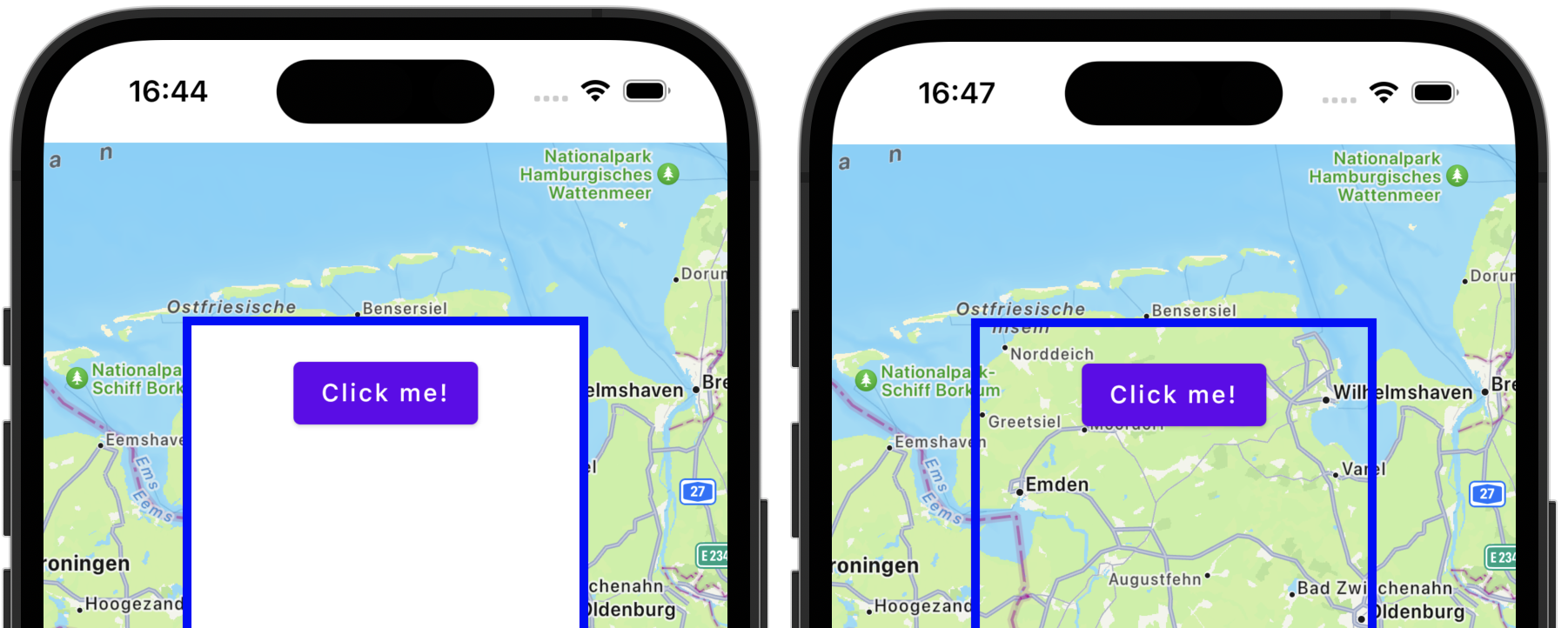
Clipping. You're not limited by a rectangular shape: clip and shadow modifiers work correctly with SwingPanel now.
// Flag necessary to enable the experimental blending System.setProperty("compose.interop.blending", "true") SwingPanel( modifier = Modifier.clip(RoundedCornerShape(6.dp)) //... )You can see the way a
JButtonis clipped without this feature on the left, and the experimental blending on the right:
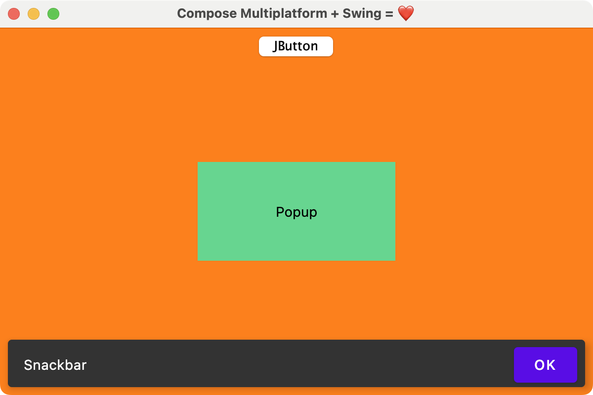
Overlapping. It is possible to draw any Compose Multiplatform content on top of a
SwingPaneland interact with it as usual. Here, "Snackbar" is on top of the Swing panel with a clickable OK button:
See known limitations and additional details in the description of the pull request.
Web
Kotlin/Wasm artifacts available in stable versions of the framework
Stable versions of Compose Multiplatform support Kotlin/Wasm targets now. After you switch to 1.6.0, you don't have to specify a particular dev-wasm version of the compose-ui library in your list of dependencies.
Known issues: missing dependencies
There are a couple of libraries that can be missing with a default project configuration:
org.jetbrains.compose.annotation-internal:annotationororg.jetbrains.compose.collection-internal:collectionThey may be missing if a library depends on Compose Multiplatform 1.6.0-beta02, which isn't binary compatible with 1.6.0. To figure out which library that is, run this command (replace
sharedwith the name of your main module):./gradlew shared:dependenciesDowngrade the library to a version depending on Compose Multiplatform 1.5.12, or ask the library author to upgrade it to Compose Multiplatform 1.6.0.
androidx.annotation:annotation:...orandroidx.collection:collection:...Compose Multiplatform 1.6.0 depends on collection and annotation libraries that are available only in the Google Maven repository.
To make this repository available to your project, add the following line to the
build.gradle.ktsfile of the module:repositories { //... google() }